
Top 12 Bluechip Stocks for 2025

By Brijesh Bhatia (@bbrijesh9/X)
Pune, 28th December 2024: In technical analysis, ratio chart is a tool used to evaluate the relative performance of one asset versus another. These charts provide insights into the strength or weakness of one asset against a benchmark or a peer group.
What is a Ratio Chart?
A ratio chart is a graphical representation of the relative performance between two assets, typically shown as a ratio of one asset’s price to another. For example, a stock-to-index ratio chart would display the price of a stock compared to an index, capturing how the stock is performing relative to the broader market or a chosen benchmark.
The ratio is calculated as:
Ratio=Price of Asset A/ Price of Asset B
If the ratio line is rising, it indicates that Asset A or the numerator is outperforming Asset B, while a falling ratio suggests that Asset B is outperforming Asset A. The ratio chart helps traders identify trends, compare different stocks or assets, and understand the strength of one asset relative to another.
Defining Trends Using Ratio Charts
To define trends using a ratio chart, traders look at the direction of the ratio line. The movement of the ratio line can help determine whether one asset is in a bullish or bearish trend relative to another.
- Rising Ratio Line: If the ratio line is trending upward, it means that the asset in question (Asset A) is a relative outperformer compared to Asset B.
- Falling Ratio Line: If the ratio line is sloping downward, Asset A is underperforming relative to Asset B.
- Flat Ratio Line: A flat or sideways-moving ratio line indicates neutral performance, in which neither asset shows any particular strength over the other.
Traders can define a trend on the ratio chart by drawing trendlines or looking at other technical indicators, such as moving averages, which can further confirm the direction and strength of the trend.
How to Trade Using Ratio Charts
Ratio charts are a versatile tool for traders who want to take advantage of relative strengths or weaknesses. Here’s how you can trade using ratio charts:
- Identify Strong and Weak Stocks: By comparing stocks with an index or each other, you can quickly identify which stocks perform better in the market. A rising ratio indicates strength, and traders can consider buying those stocks while selling those with a declining ratio.
- Trend Confirmation: A sustained uptrend in the ratio chart can confirm that the stock is likely to continue outperforming the benchmark or another stock. In this case, traders may decide to stay long in the stock or increase their position.
- Hedging and Diversification: Ratio charts can also help traders build diversified portfolios by identifying relative strength. If one asset is outperforming another, traders may consider shifting allocations to the stronger asset to maximise returns.
Multi-Timeframe Ratio Analysis for Largecap Stock Selection
Understanding the relative performance of stocks over different timeframes is crucial for long-term investors and traders. When selecting large-cap stocks from indices like the Nifty100 for 2025, Multi-Timeframe Ratio Analysis can provide valuable insights.
What is Multi-Timeframe Ratio Analysis?
Multi-timeframe Ratio Analysis involves studying the ratio of one asset to another across multiple timeframes (such as quarterly, monthly, weekly, and daily) to assess the consistency and strength of trends. This helps traders and investors make more informed decisions by considering the broader and more granular picture of the asset’s performance.
Using RZone by Definedge for Multi-Timeframe Ratio Analysis
RZone by Definedge is a tool that allows users to scan ratios across multiple timeframes efficiently. By applying multi-timeframe analysis, traders can scan the relative performance of Nifty100 stocks against Nifty50 across different timeframes: quarterly, monthly, weekly, and daily.
When conducting Multi-Timeframe Ratio Analysis, the key is to look for stocks where the ratio line is rising consistently across all the timeframes. A stock that shows a rising ratio on the quarterly, monthly, weekly, and daily charts signals strength over various periods, suggesting that it is a good candidate for future outperformance.
Here are the 12 stocks that are outperforming the Nifty50 on quarterly, monthly, weekly and daily timeframes.
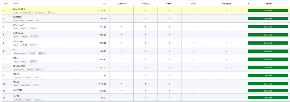
Source: RZone, Definedge Securities
In summary, ratio charts are an essential tool in technical analysis. When combined with Multi-Timeframe Ratio Analysis using tools like RZone by Definedge, traders can scan large-cap stocks from the Nifty100 with greater precision. By comparing Nifty100 stocks with Nifty50 across multiple timeframes—quarterly, monthly, weekly, and daily—you can identify stocks that are likely to show continued strength in 2025. A rising ratio across all timeframes is a clear signal that a stock is outperforming the index and may present a good investment opportunity.
A word of caution here would not be out of context. The ratio study would prove rewarding when the overall market trend is bullish. In a bearish market scenario, it is quite possible that the ratio chart is rising because the numerator is falling at a lower pace compared to the denominator.
Disclaimer: The purpose of this article is only to share interesting charts, data points and thought-provoking opinions. It is NOT a recommendation. This article is strictly for educative purposes only. As per SEBI guidelines, the writer and his dependents may or may not hold the stocks/commodities/cryptos/any other assets discussed here. However, clients of Definedge may or may not own these securities.
(About author: Brijesh Bhatia has over 18 years of experience as a trader and technical analyst in India’s financial markets. He is a well-known face in the business channel as a Market Expert and has worked with broking giants like UTI, Asit C Mehta, and Edelweiss Securities. He is currently a Senior Research Analyst and Editor at Definedge.)